


Need a website that works great on smartphones? The mobile first web design service at Meshvin Media can help. The professional mobile website designers at Meshvin Media create websites that look fantastic and work smoothly on all screen-size mobile devices.
Whether you're targeting on-the-go shoppers, mobile-first users, or building a brand for the next generation, we ensure your site loads fast, looks clean, and delivers a seamless experience on every mobile device. From intuitive navigation to lightning-fast performance, we optimize every touchpoint to keep your visitors engaged and coming back. Let Meshvin Media turn your mobile site into a powerful business asset that converts traffic into loyal customers.
Get a website that functions just as well on mobile devices as it does on desktops. Meshvin Media is your trusted mobile-friendly web design agency that makes sure that a poor mobile experience does not turn away customers from your website.
The mobile responsive web design company has designers who specialize in creating great mobile experiences. They know how to make sites that work perfectly on smartphones.
Your site is tested on various real smartphones and tablets. Meshvin Media's professional mobile-first web designers ensure it works well on different devices.
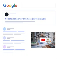
The mobile website design agency builds sites that search engines love. A SEO optimized site helps your mobile site rank well in search results.
The team can integrate mobile-specific features like click-to-call buttons or GPS directions. Mobile users will find your site more beneficial and easy-to-use as a result.
Each website is uniquely designed for your business. The professional mobile website designer creates a mobile site that matches your brand and meets your specific needs.
Meshvin Media offers affordable mobile website design services. Getting a great mobile website doesn't have to break the bank.
Create stunning, responsive websites that capture attention and convert visitors into loyal customers.
Ideal for small businesses or startups looking to establish their online presence.
Suitable for growing businesses aiming to expand their reach and visibility.
Designed for established businesses looking to dominate their market online.


Mobile web design helps you connect with users on every type of device, especially smartphones, which now account for the majority of internet traffic. Whether your visitors are browsing on the go or from different locations, your website adjusts instantly, giving them a smooth experience. A mobile-friendly site ensures you don't miss out on potential customers who might abandon your site if it's not responsive. At Meshvin Media, we focus on building mobile-first websites that naturally expand your online reach, helping your brand grow faster across demographics, time zones, and screen sizes.
Speed matters a lot in today's digital world. Mobile-optimized websites load significantly faster because they're designed with lighter code and better asset management. Users expect a website to load in under three seconds, and anything longer can lead to bounce. Our mobile web design ensures your pages load quickly without compromising quality or aesthetics. By optimizing images, scripts, and layout for mobile, Meshvin Media helps your site deliver performance that keeps users engaged and improves your SEO rankings at the same time.
User experience (UX) is at the core of mobile web design. Everything from layout, text size, button placement, and navigation is crafted with mobile users in mind. This means fewer pinches, zooms, or scrolls and more intuitive interactions. A smooth experience keeps visitors on your site longer and leads to better conversions. At Meshvin Media, we make sure every design element supports effortless navigation and user satisfaction on all devices-because a happy visitor is more likely to become a loyal customer.
Google gives priority to mobile-friendly websites in its search results. That means a responsive design isn't just good for users-it's good for your search engine rankings too. Mobile web design contributes to lower bounce rates, faster page speed, and better on-page metrics, all of which positively influence your SEO. At Meshvin Media, we ensure every website we build meets Google's mobile-first indexing standards, giving your brand a stronger foundation to rank and perform well online.
Mobile-optimized websites make it easier for users to interact-whether it's clicking a button, submitting a form, or watching a video. Everything is aligned for touch interaction, quick response, and seamless content flow. When users enjoy browsing your site, they're more likely to stay longer, explore more pages, and take action. Meshvin Media focuses on designing mobile experiences that are not just responsive, but engaging-turning casual visitors into real customers.
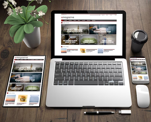
A mobile-responsive website eliminates the need to build and maintain separate sites for desktop and mobile. This saves both time and money while offering a consistent user experience across all devices. With just one version to manage, updates become simpler and more efficient. Meshvin Media builds smart, scalable solutions where a single design does the job of many-helping your business grow without unnecessary overhead.
Conversions happen when the experience is smooth, intuitive, and fast-which is exactly what mobile-first design delivers. Whether it's a purchase, a signup, or a call inquiry, mobile-friendly layouts reduce friction at every step. At Meshvin Media, we build designs that remove roadblocks-ensuring that your call-to-actions are accessible, forms are easy to fill, and your funnel flows naturally. That means more leads, more sales, and better ROI.
With new devices constantly entering the market, future-proofing your website is critical. A mobile-responsive design adapts to all screen sizes-whether it's a phone, tablet, foldable device, or something new. Meshvin Media creates websites that are not only beautiful and fast but also flexible enough to evolve with changing tech trends. This ensures long-term value and performance, so your website stays relevant, functional, and competitive.
We craft clean, user-friendly designs. Focused on both look and usability.
We create high-converting landing pages. Simple, fast, and built to engage.
Seamless performance on every device. Fast, responsive, and user-friendly design.
Reliable hosting with secure, scalable solutions. Clean, efficient code for smooth website performance.
Creative visuals that speak your brand. From logos to banners, we design it all.
Boost your website's visibility. Rank higher and attract more traffic.
Track user behavior with precise data insights. Optimize strategies using real-time analytics.
Seamlessly migrate your current content with ease. Ensure data integrity and quick integration.
Deliver seamless browsing across every device and turn more visitors into loyal customers with fast, responsive mobile web design.

Increased Viewers

Lower Maintenance

Optimized Videos and Images

Fluid Grids

Enhanced Design Experience.

Improved SEO

Easier Analytics Reporting

Less Loading Time: 5 Seconds or Lesser
With the majority of users now browsing on smartphones, a mobile-optimized website ensures a seamless experience. It improves user engagement, boosts conversions, and ranks better on search engines.
A mobile-friendly website adjusts to fit all screen sizes, loads quickly on mobile data, has easy-to-tap buttons, simplified navigation, and optimized content layout for smaller devices.
We offer both options. If your existing site can be adapted, we'll optimize it for mobile. If not, we recommend a redesign using responsive or mobile-first design strategies for better performance.
Typically, a mobile website project takes between 1 to 4 weeks, depending on your requirements, the number of pages, and custom features involved.
Absolutely. We follow mobile SEO best practices including fast load times, responsive design, structured content, and clean code to help your site perform well in mobile search results.
Yes. We design and rigorously test your website across all major screen sizes and devices, including iPhones, Android smartphones, and tablets, to ensure a consistent and polished user experience.
Yes, we build mobile sites using user-friendly CMS platforms like WordPress, so you can easily make updates without needing to code.
We create responsive websites that work flawlessly across all devices and screen sizes.
